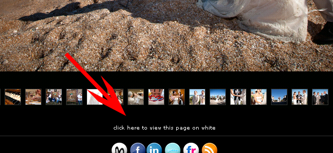
Because for some people, a white wedding is best viewed on website that’s white – not black.
Among various editing and major back-end redesign and cleanup that I’ve been doing on my server and website, I overhauled my wedding section last night. Ironic that as my sports work and portraiture is picking up that I decide it’s time to redo my wedding section…. but, now is as good a time as any.
My entire portfolio is viewable only on a black background. I do this for a couple very simple reasons. Colored backgrounds are distracting. Designs and wallpaper on your website are distracting. My portfolio has always been kept minimalistic and clean.
But, I’ve been thinking I should add the option for people who like viewing wedding images on white, instead of black.
So now my clients and potential clients have the option in my Wedding section to view everything on white – just click here:

Simple, huh?
Go check it out, see what you think of the new white wedding section. Post any feedback and thoughts you may have.
Hope everyone has a great weekend. I’ll have some new portraits on BMX riders this upcoming week. I’m also setting up a new military war-era shoot with some models I know in two weeks.
